Branding and Customization
The Theme Editor lets you customize the UI to match your corporate branding. You can adjust theme colors, shapes, sizes, and logos.
Capabilities
- Simple mode: Brand color, info color, border radius (square/rounded), logo, icon, and light/dark appearance.
- Advanced mode: Paste raw Ant Design theme JSON. Every global token and per-component override is accepted as-is, plus a few Operaide-specific extensions (see below).
- Dark-mode overrides: Put a second
ThemeConfigunderdarkOverwritein the same JSON. It is merged on top of the light theme when dark mode is active. - Selective Theming: Start from the default theme and override only what you need.
- Organization-Specific Themes: Store multiple themes per environment and apply them per organization.
Theme Editor Tabs
The Theme Editor provides two editing modes: Simple and Advanced.
Simple Editor
The Simple Editor covers basic customization:
| Setting | Description |
|---|---|
| Appearance | Switch between light and dark mode to preview and configure each variant |
| Logo | Upload your organization's logo (250×50 px). Supported formats: .png, .jpg, .jpeg, .svg |
| Icon | Upload a signet or icon for compact views (50×50 px). Same supported formats as the logo |
| Brand Color | Primary color used throughout the UI. In dark mode, the color is applied on top of the light theme |
| Info Color | Color for informational elements and highlights. Same dark-mode behavior as Brand Color |
| Border Radius | Switch between square (sharp corners) and rounded UI elements |
Advanced Editor
The Advanced Editor accepts a raw Ant Design theme JSON. Operaide adds a few extensions on top (dark-mode overrides and Operaide-specific component tokens, see below); everything else Ant Design accepts works as-is.
- Define your theme in the Ant Design Theme Editor
- Copy the configuration from its Config dialog
- Paste the JSON into the Advanced Editor
Click Overview in the Ant Design Theme Editor to see all available widgets and tokens.
Empty Configuration: Uses the system-wide default theme.
Operaide-specific extensions
On top of the standard Ant Design schema, the following keys are recognized:
darkOverwrite: A secondThemeConfigmerged on top of the base theme when dark mode is active. Set only the tokens that should differ from light mode.components.OrganizationBranding: Logo URLs -adminLogo(top-bar logo) andsignetLogo(compact icon). Each haslogoUrl,height,width.components.CardItem:coverHeight,cardWidthfor app cards.components.RoleTags:superAdminColor,systemAdminColorfor role badges.components.StatusBar:colorBg,colorTextfor the status bar.components.MermaidDiagram: Reaktor diagram colors - node fill and stroke per Aktor type (aktorInputFill,aktorAIFill,aktorToolFill,reaktorOutputFill, and their*Strokecounterparts), plusgroupFill,groupStroke,groupHoverFill,lineColor,textColor,dotColor,dotSpacing.
Example Configuration
{
  "token": {
    "colorPrimary": "#e93841",
    "colorInfo": "#e93841",
    "colorSuccess": "#13c2c2"
  }
}
Example Before and After
| Default Theme | Custom Theme |
|---|---|
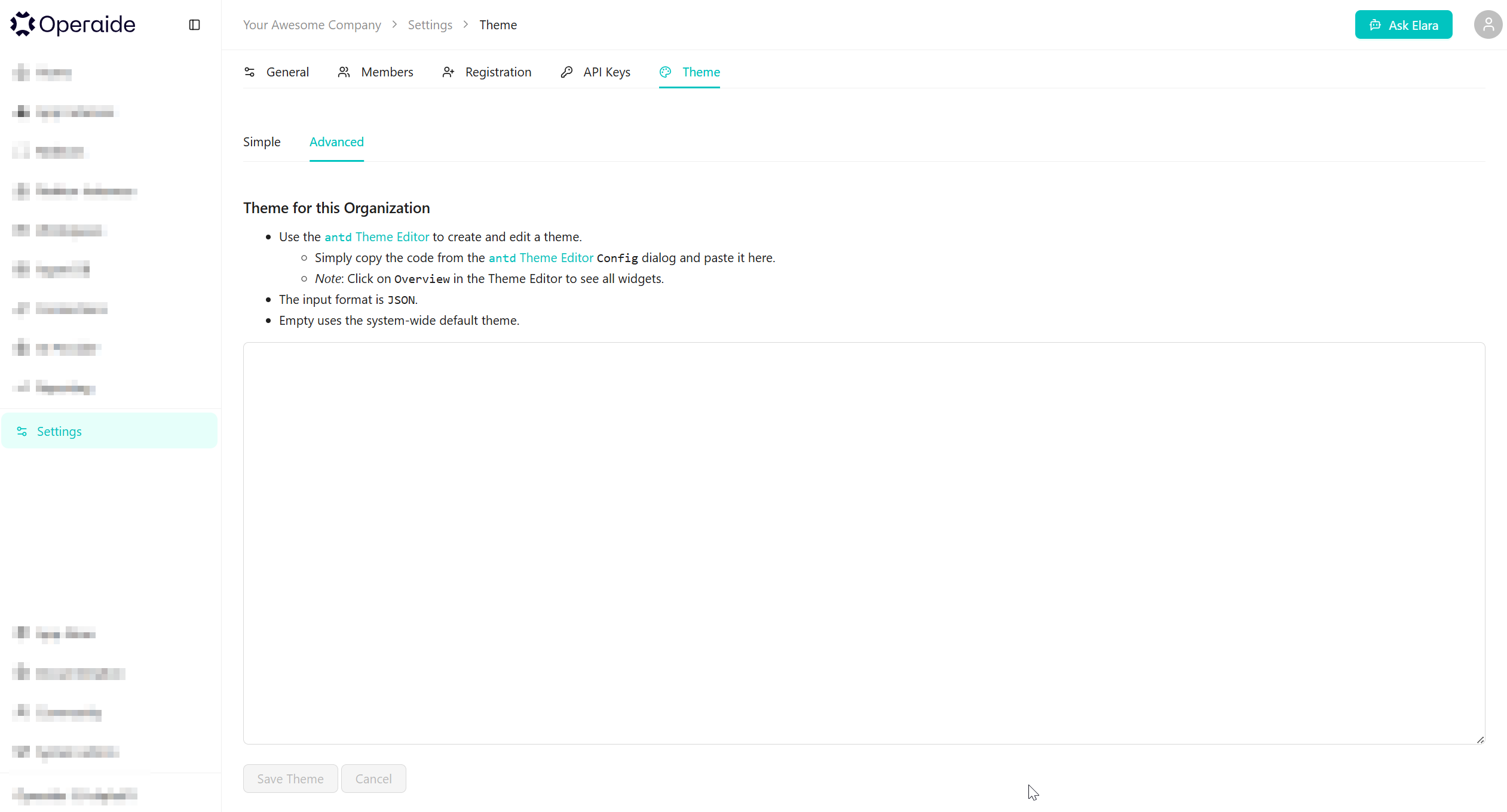 | 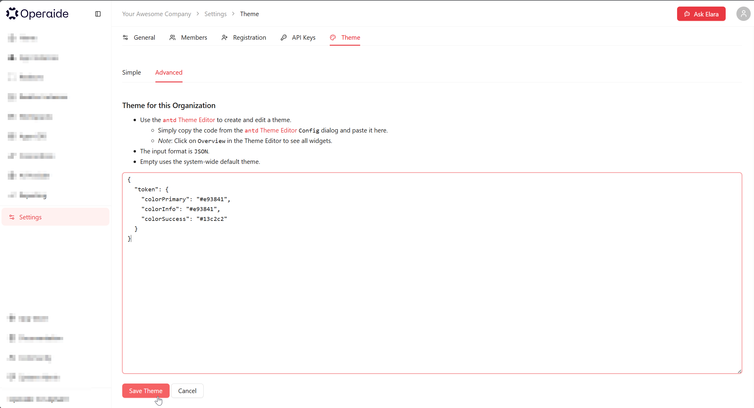 |
Permissions
| Capability | Required Role |
|---|---|
| Simple Editor (colors, border radius) | System Admin |
| Advanced Editor (JSON configuration) | Internal Developer |
| Logo and Icon upload | Super Admin |
The Theme Editor is controlled by the enableThemeEditor feature flag, which must be enabled for the organization.
How to Access
- Navigate to Settings in the sidebar
- Select the Theme tab
- Choose between Simple or Advanced editor
- Make your changes
- Click Save Changes
Theme editing must be enabled for your organization. Contact your System Administrator if the Theme tab is not visible.